
If you have been drawing horizontal lines on your chart and watching price slice straight through them, you are not doing it wrong. You are doing what almost every trader does at the start. Support and resistance are not magic lines the market respects. They are zones where buying or selling pressure has shown up often enough that, the next time price returns, something reactive tends to happen more often than not.
In this guide I will walk through how I mark levels on my own charts, the habits I have stopped after years of stopouts, and the simple rules that keep me from overfitting the chart.
- Anchor to the last obvious swing high or swing low before a strong move.
- Draw zones, not lines. A level is a band, not a hairline.
- Wait for a reaction (rejection wick, slowdown, role reversal) — don’t buy the touch.
- Keep five levels maximum on the chart you actually trade.
- Plan invalidation before entry. If you can’t name where you’re wrong, you don’t have a trade.
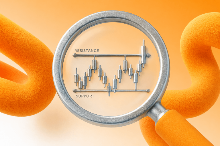
What support and resistance really mean, in one paragraph
Support is a price area where buyers have previously stepped in hard enough to stop a decline. Resistance is the mirror image. Everything else, including trendlines, moving averages, and round numbers, is a variation on the same idea: prior behavior tends to influence future behavior, until it does not. Levels are statistical tendencies backed by trader memory, clustered orders, and risk systems, not physical walls. Once you internalize that, you stop expecting levels to “hold” and start asking a more useful question: how will I know quickly if this one is not holding?
The level is a zone, not a line. The trigger is the rejection close, not the first touch. Invalidation sits beyond the zone — not on its edge.
Step 1: Start with obvious swings, not clever ones
When I open a new chart, I do not scan for subtle patterns. I look for the most recent swing high and swing low that anyone with two eyes would agree on. If I need to zoom in to justify a level, it is probably not the level.
A swing high is a peak with lower highs on both sides. A swing low is a trough with higher lows on both sides. That is the textbook definition. The swings worth marking are the ones that caused a visible impulse afterward. Price did not just drift away, it ran.
A common mistake is anchoring to the very tip of a long wick. That wick is often a liquidity spike, where one candle shot out, tagged stops, and instantly reversed. The tip of the wick is not the level. The cluster of candle bodies around that wick is the level. When you draw zones, include both the wick and the body cluster.
Step 2: Draw zones, not lines
The biggest upgrade I ever made to my charting was not a new indicator. It was deleting every horizontal line and redrawing them as bands.
Markets do not fill orders at one exact price. Institutions scale in and out across a range. When you draw a hairline, you are pretending the market has the same precision your cursor does. It does not.
A practical starting point for zone width is roughly 0.25 times the ATR(14) of the timeframe you are trading. On a 15-minute chart of a liquid FX pair with an ATR around 20 pips, that gives you a 5-pip zone. Too wide feels mushy. Too tight gets hunted. Most traders tighten too early. If I had to pick one default for a newer trader, I would say wider zones with confirmation and smaller size beats tight zones and getting chopped up.
Zone width ≈ 0.25 × ATR(14) of the timeframe you trade. Adjust up in volatile conditions, down in quiet ones.
| Timeframe & instrument | Typical ATR(14) | Starting zone width |
|---|---|---|
| 5-min EUR/USD | ~6 pips | ~1.5 pips |
| 15-min EUR/USD | ~12 pips | ~3 pips |
| 1-hour Gold (XAU/USD) | ~$6 | ~$1.50 |
| 1-hour US 100 | ~60 pts | ~15 pts |
Indicative numbers only. ATR changes with volatility — read your broker’s live value before sizing a zone.
Step 3: Use two timeframes, never more
Multi-timeframe analysis is oversold in most articles. You do not need five charts. You need two.
The higher timeframe tells you the story. Where is price expensive, where is it cheap, where did the last meaningful reaction happen. The lower timeframe is where you execute. If I trade the 5-minute, I look at the 1-hour for context. If I trade the 15-minute, I look at the 4-hour. Anything more and you are not analyzing, you are procrastinating.
The filter I use in practice: a lower-timeframe level is only high-priority if a higher-timeframe level agrees with it. If 5-minute “support” has no corresponding story on the 1-hour, it is probably intraday noise that disappears by tomorrow.
Step 4: A touch is not a signal. A reaction is.
This is where most support and resistance strategies quietly fail. Traders see price approach a level and click buy. That is not a trade, that is a reflex. The level does not give you the edge. The market’s reaction to the level does.
What I wait for, roughly in this order:
- A rejection close inside the zone. Price dips in, gets bought back, and the candle closes well off the low. One candle is not gospel, but a strong rejection close is a much better entry trigger than a simple tag of the level.
- A structure shift on the lower timeframe. If price was making lower lows and suddenly prints a higher high after touching support, buyers are showing up. Small signal, but real.
- A volatility compression into the zone followed by expansion. Price slows down, range tightens, then breaks in your direction. This one has the best risk-reward in my experience, because invalidation is mechanically close.
I do not stack all three. One clean confirmation beats three overlapping filters that delay you until the move is already over.
Step 5: Real breakouts vs stop runs
Most breakouts I see on retail timeframes are liquidity events, not trend starts. Price pierces the level, triggers a cluster of stops, then snaps back inside. Traders who entered on the first break candle get spat out.
The filter I trust is not proprietary or clever. It is acceptance. A break is more likely to continue if price holds beyond the zone for more than one or two candles on the execution timeframe, and especially if price retests the old level from the other side and bounces. That role reversal is the cleanest breakout confirmation I know.
When in doubt, skip the first break candle. The second entry, on the retest, is statistically better even if it feels slower.
- Wick pierces the zone; candle closes back inside.
- No follow-through on the next one or two candles.
- Often happens on thin liquidity or around news.
- Traders who chased the break get stopped on the snap back.
- Multiple candles close beyond the zone.
- Pullback to the zone holds as new support or resistance.
- Momentum continues after the retest, not before it.
- Role reversal is the cleanest breakout confirmation you get.
Step 6: Keep five levels or fewer
I used to mark every swing I could find. My chart looked like a parking lot. The result: every move “respected a level,” which meant none of them did anything useful.
Now I force myself to keep a hard cap of five levels maximum on my execution chart, combining support and resistance. If I am tempted to add a sixth, something has to come off. This is not aesthetic. It forces me to prioritize. If I cannot rank my levels, I do not understand them well enough to trade them.
The priority order that works for me:
- The nearest level in the direction price is moving.
- The last level that caused a strong impulse.
- The session high or low if I am day trading.
- Anything else that earns its place after the above.
Everything beyond five gets deleted, not grayed out.
Why a “broken” level often comes back to haunt price
When a support zone finally breaks with real acceptance, it rarely disappears from the chart. It flips sides. The same zone that buyers defended becomes the zone sellers now defend. Traders who got stuck long inside it want to exit at breakeven, and fresh shorts use it as a clean entry. That is why retests of broken zones are often cleaner trades than the original break.
The zone itself did not change. What changed was which side of it price was on. This is role reversal — and it’s often the cleanest breakout confirmation you’ll get.
Mistakes I see repeatedly, including ones I made
- Drawing levels to justify a trade I already wanted. If I am bullish and scanning for support, I will find it. The fix is to mark levels on a flat emotional state, then decide.
- Moving a level after price disagrees. If I have to nudge the zone to keep being right, my thesis was already wrong. The fix is to invalidate, reset, and wait for the next setup.
- Ignoring instrument personality. Gold does not behave like EUR/USD. Single stocks can gap on earnings in ways indices rarely do. The same zone logic applies, but the buffers and acceptance rules have to adjust.
- Trading through news with tight levels. Economic releases vaporize normal behavior for 10 to 30 minutes. Either stand down, widen zones and shrink size, or have a specific news playbook. Pretending the release is not happening is the one option that never works.
Realistic expectations
Support and resistance does not tell you what will happen. It tells you where the odds shift, and where risk is cheapest to define. That is the actual edge. Traders who last long enough to compound are not the ones who are right most often. They are the ones whose losses stay small and whose wins are structurally larger because entries sat right next to invalidation.
If you take one thing from this, let it be this: a good level is not one that holds. It is one where your loss is small if it does not.