Forget Tiffany’s — this diamond is a much more precious gift for traders! The diamond chart patterns aren’t something you wear on a ring, but a nifty tool to help you shine in the market. Ready to add some sparkle to your trading strategy? Let’s dive into this gem of chart analysis and get some diamond pattern technical analysis tips for excellent trades.
What is a diamond chart pattern?
Actually, there are two types of diamond patterns that you might observe while analysing the charts. One is called the diamond top, the other – the diamond bottom. Their main purpose is to signal a potential price reversal, either upward or downward. Traders want to spot and understand these patterns’ signals in time to make a move before the reversal happens. Let’s look at these patterns separately.
The diamond top pattern
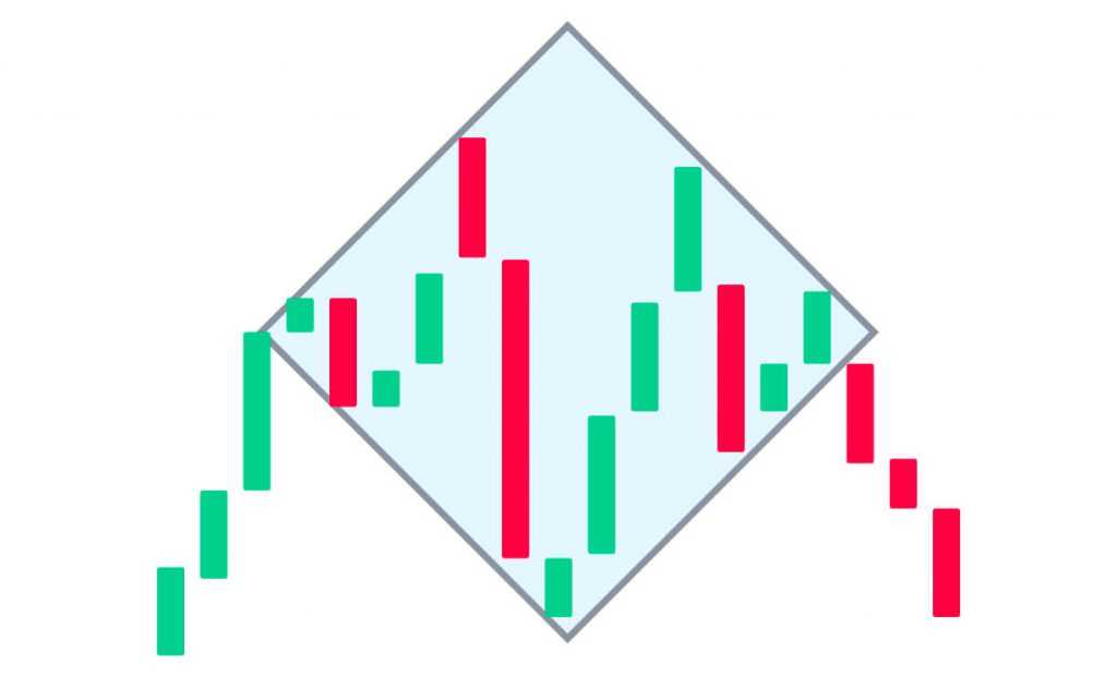
A diamond top pattern does not occur too often, but when it appears, it may be a sign of an upcoming strong trend reversal. It can be spotted when an upward trend is about to end, with the price flattening and moving sideways.
So what does a diamond top look like? The sequence is the following:
- The price is trending upward.
- At first, you’ll notice the candles expand, with the peaks (highest points of the price movements) shifting higher and the troughs (lowest points) moving lower.
- Then the price action changes, with the peaks appearing lower and troughs – higher.
- Normally, connecting the highs and lows forms a diamond-like shape. Note that the diamond does not have to be symmetrical. It can be slightly tilted to the side, too.

☝️
Note that the diamond top pattern is often confused with the head-and-shoulders formation. Carefully assess the patterns to make an informed decision.
The diamond bottom pattern
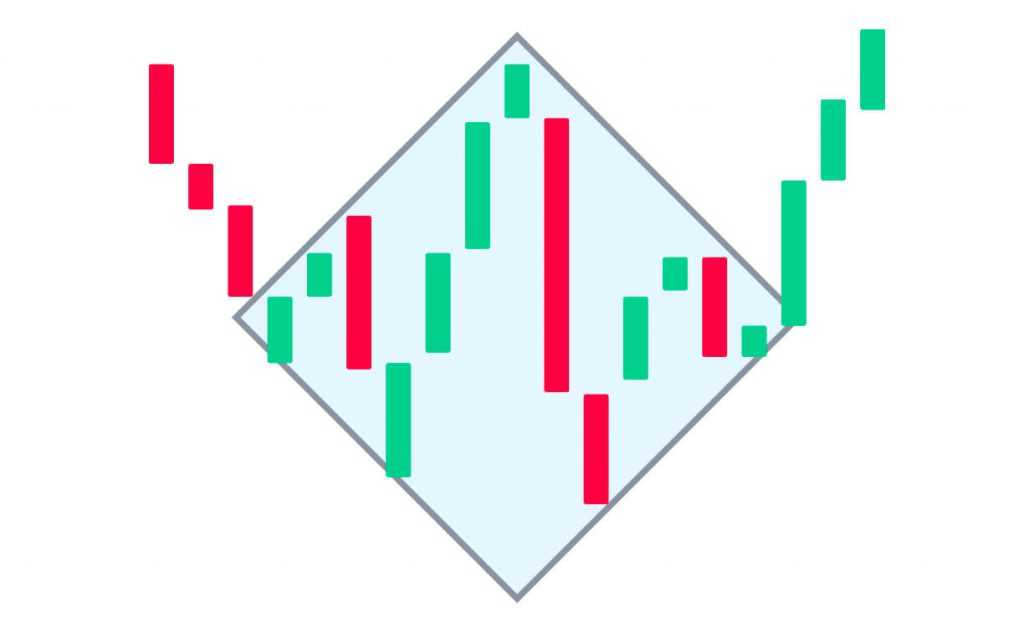
An opposite of the diamond top is the diamond bottom formation, which occurs at the end of a strong downward trend.

Here’s what to look for when searching for this pattern:
- The price is trending downward.
- Candles behave similarly to the diamond top formation, expanding and creating a diamond-like shape. The difference is that in this case, the price drops into the diamond from above. This indicates that the pattern is a diamond bottom, not top.
The diamond pattern chart signals represent the struggle between the buyers and sellers on the market: buyers push prices up to a minor new high until selling pressure forces prices back down. The widening pattern can continue for several swings, but usually doesn’t last too long.
A signal for a Buy entry is the price breaking through the resistance line upwards. If the price breaks through the diamond bottoms pattern downwards, decreasing instead of increasing, a trader may consider looking for another pattern in such case. A trader’s job is to find diamond chart patterns that lead to a price reversal.
☝️
In conclusion
Trading diamond chart patterns isn’t for the faint-hearted, as this shape requires a sharp eye and lots of practice. However, learning the diamond pattern technical analysis tips may be useful for both novice and experienced traders. Please note that no strategy or chart pattern can guarantee 100% success, so a strong risk management approach needs to be applied along with it.

