

If you have ever opened a trading platform, you were likely met with a chaotic screen of red and green bars, flashing numbers, and zigzagging lines. It is enough to make any beginner want to close the laptop immediately. However, here is a secret: trading charts are simply a visual history of price over time.
Behind every tick and every candle is the collective psychology of millions of buyers and sellers. Once you learn to decode the visual language of charts, you aren’t just looking at data; you are looking at a map of human emotion — fear, greed, and indecision. In this guide, you’ll learn exactly how to read trading charts step by step, even if you’re starting from zero.
What Is a Trading Chart?
A trading chart is a graphical representation of the price of an asset over a specific period. Whether you are looking at Bitcoin, Gold, or a currency pair like EUR/USD, the anatomy of the chart remains the same across every market.
- Y-axis (Vertical): This represents the Price.
- X-axis (Horizontal): This represents Time.
- The Plot: The area in the middle where the price action is drawn.
Think of a chart like a biography. Instead of words, it uses price points to tell the story of how much people were willing to pay for an asset yesterday, an hour ago, or even a minute ago. By looking at where the price has been, traders try to identify structures that suggest where it might go next.
The 3 Main Types of Trading Charts
While there are dozens of ways to visualize price, 99% of traders use one of three main types. Choosing the right one depends on how much detail you need.
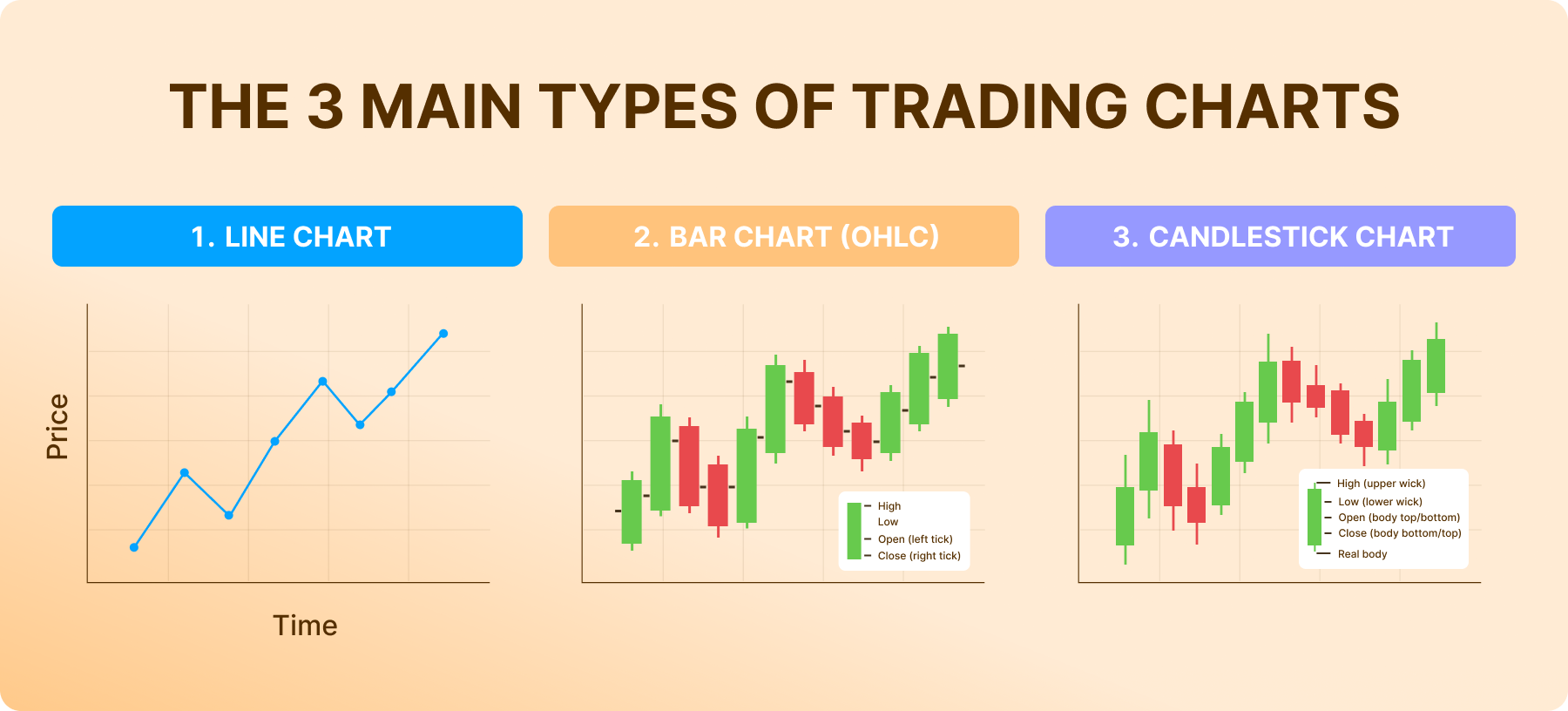
1. Line Chart
The line chart is the simplest version of a trading chart. it is created by connecting a series of closing prices for a given period.
- Pros: It filters out the “noise” and shows the overall trend clearly.
- Cons: It lacks detail. You cannot see how high or low the price went during the day — only where it ended.
2. Bar Chart
Bar charts (also known as OHLC charts) provide more data than line charts. Each vertical bar represents a specific period (like one day).
- High: The top of the bar.
- Low: The bottom of the bar.
- Open: The small horizontal “tick” on the left.
- Close: The small horizontal “tick” on the right.
3. Candlestick Chart (The Industry Standard)
Candlestick charts are the most popular format in the world. Originally developed by Japanese rice traders in the 1700s, they provide the same data as a bar chart but in a much more visual, color-coded way.
The “body” of the candle shows the range between the opening and closing price, while the “wicks” (or shadows) show how far the price strayed during that timeframe.
How to Read a Candlestick
To read a candlestick, you first look at the color. While you can customize your chart, the universal standard is:
- Green (Bullish): The price closed higher than it opened. Buyers won.
- Red (Bearish): The price closed lower than it opened. Sellers won.
The Story the Candle Tells
The shape of a candle tells you who is in control of the market:
- Long Body: Represents strong momentum. If it’s a long green candle, buyers were aggressive.
- Long Wicks: These represent “rejection.” If a candle has a long upper wick, it means the price tried to go high but sellers pushed it back down.
- Small Body (Doji): This represents indecision. Neither buyers nor sellers could take control, suggesting a potential change in direction.
Understanding Timeframes
One of the biggest points of confusion for beginners is the “Timeframe” setting. You can set a chart so that every single candle represents:
- 1 Minute (M1): High-speed, very noisy.
- 1 Hour (H1): A balance of detail and trend.
- 1 Day (D1): Shows the “Big Picture” and long-term value.
Crucial Note: The market can look like it is crashing on a 5-minute chart while it is actually in a massive uptrend on the Daily chart. Beginners should generally start with higher timeframes (1-hour or Daily) because they provide more reliable signals and less “random” movement.
What Is a Trend?
“The trend is your friend” is a common trading phrase for a reason. Prices don’t move in a straight line; they move in waves. Recognizing the direction of these waves is the first step in chart analysis.
- Uptrend: Characterized by Higher Highs (HH) and Higher Lows (HL). The market is climbing stairs.
- Downtrend: Characterized by Lower Highs (LH) and Lower Lows (LL). The market is sliding down.
- Sideways (Range): The price is bouncing between a specific ceiling and floor, showing no clear direction.
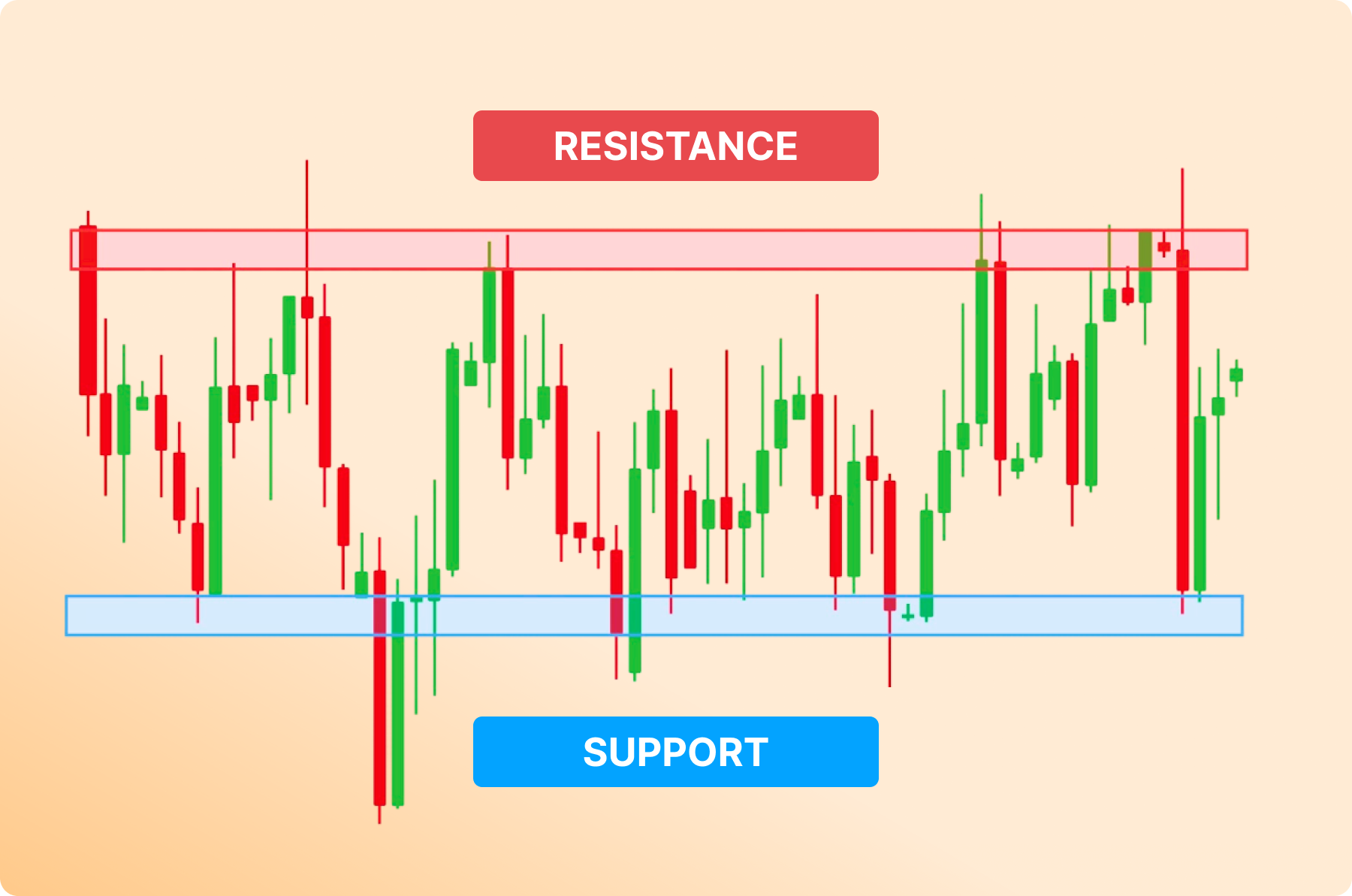
Support and Resistance (Core Concept)
If you only learn one thing about chart reading, let it be this. Support and resistance are the “invisible levels” where price tends to stop and reverse.
- Support (The Floor): A price level where buyers usually step in to prevent the price from falling further.
- Resistance (The Ceiling): A price level where sellers usually step in to prevent the price from rising further.
Think of it like a rubber ball bouncing in a room. The floor is support, and the ceiling is resistance. When the price breaks through one of these levels (a “Breakout”), it often signals a major shift in market psychology.
Basic Chart Patterns Beginners Should Know
Patterns are recurring shapes on a chart that suggest what might happen next. While there are hundreds, beginners should focus on the most reliable ones.
1. Double Top / Double Bottom
- Double Top: Price hits a resistance level twice and fails to break through, forming an “M” shape. This suggests the price might drop.
- Double Bottom: Price hits a support level twice and fails to break through, forming a “W” shape. This suggests the price might rise.
2. The Breakout
A breakout happens when the price finally closes outside a support or resistance zone. This often triggers a flood of new orders, leading to a fast move in the direction of the break.
Volume: The Engine Behind the Move
If the price is the “car,” then volume is the “fuel.” Volume tells you exactly how much commitment is behind a specific price movement. On almost any trading platform, you will see volume displayed as a histogram — a series of vertical bars — at the very bottom of the chart.
Why Volume is Your “Truth Detector”
The market is a constant battle between buyers and sellers. Volume tells you how many people are actually participating in that battle.
- Confirming a Breakout: Imagine the price hits a heavy resistance level (the ceiling). If the price breaks through that ceiling on low volume, it’s like someone nudging a door open; it might just be a “fakeout” or a “bull trap.” However, if the price smashes through on massive volume, it means institutional “Big Money” is involved. That move is far more likely to continue.
- Spotting Exhaustion: If the price is rallying higher and higher, but the volume bars are getting smaller and smaller, the move is “exhausted.” It means buyers are running out of steam, and a reversal or a crash might be just around the corner.
- The High Volume Rejection: When you see a long wick on a candle accompanied by a huge spike in volume, it’s a powerful signal. It shows that one side tried to take control, but the other side stepped in with overwhelming force to push the price back.
A 5-Step Practice Plan for Beginners
Learning to read charts isn’t about being a math genius; it’s about developing “pattern recognition” through consistent screen time. Don’t rush into live trading. Follow this structured 5-step training plan to build your confidence.
1. Pick One “Anchor” Asset
Don’t try to track 20 different stocks or coins. Pick one major asset with high liquidity, like Gold or the EUR/USD currency pair. Every asset has its own “personality” — some move smoothly, while others are “jumpy.” By sticking to one, you’ll learn its specific habits.
2. Lock in a “High-Value” Timeframe
Forget the 1-minute or 5-minute charts for now. Those are for high-frequency algorithms and hyper-stressed scalpers. As a beginner, stick to the 4-hour (H4) or Daily (D1) charts. These timeframes filter out the “market noise” and show you the real moves that institutional investors are making.
3. Map the “Highs and Lows”
Before looking at indicators, look at the structure. Is the price making Higher Highs and Higher Lows? If so, you’re in an uptrend. If it’s making Lower Highs and Lower Lows, you’re in a downtrend. If it looks like a zigzagging mess with no clear direction, it’s a “ranging” market. Label these on your chart.
4. Draw Your “Zones,” Not Just Lines
Find levels where the price has “bounced” or reacted at least twice in the recent past. Instead of drawing a thin line, try drawing a rectangle zone. Support and resistance aren’t exact prices; they are areas where buyers and sellers are waiting.
5. Play the “Wait and Watch” Game
This is the hardest step. Don’t try to predict where the price will go. Instead, wait for the price to reach one of your marked zones. Ask yourself: “How is the price behaving now that it’s at the floor?” Is it slicing through like butter, or is it struggling and leaving long wicks behind? Observation is the best teacher.
Common Pitfalls to Avoid
Even with a plan, beginners often fall into the same traps. Avoiding these will put you ahead of 90% of other new traders.
- “Indicator Overload”: Many beginners think that adding five different indicators (RSI, MACD, Bollinger Bands, etc.) will give them a “perfect” signal. In reality, this leads to “analysis paralysis.” Your chart should be clean. Price action is the primary signal; indicators are just secondary confirmation.
- “Zooming In” Phobia: If you spend all your time zoomed in on the 1-minute chart, you’ll see “major” crashes and rallies that aren’t actually happening. Always “Zoom Out” to the Daily chart first to see the big picture before you look at the details.
- “Picking the Top”: Beginners love to try and guess when an uptrend is “over” so they can sell at the very top. This is a gamble. It is much safer to wait for the trend to actually break and turn downwards before you change your bias.
- The “Spiderweb” Chart: If you have 50 horizontal lines on your chart, every price move will hit one. This makes them useless. Only keep the most obvious and recent levels on your screen. If you have to squint to see why a line is there, delete it.
Step-by-Step Chart Reading: Gold Walkthrough
Let’s put all of this into practice with a real-world scenario. Imagine you are opening the Daily (D1) chart for Gold.
- Analyze the Trend: You look at the last three months. You notice that every peak is higher than the last one, and every dip is also higher than the last. Verdict: Clear Uptrend. You should only be looking for “Buy” opportunities.
- Locate the Support Zone: You see that back in November and again in January, Gold dropped to $2,300 and immediately shot back up. You draw a green rectangle zone around that $2,300 level. This is your “Floor.”
- Monitor Current Price: Gold is currently trading at $2,315 and is slowly moving down toward your green zone. You don’t buy yet. You wait.
- Look for the Signal: The price touches $2,300. You watch the daily candle close. It leaves a long lower wick, showing that sellers tried to push it lower, but buyers stepped in with force. You check the Volume and see a big green spike.
- Execution and Risk: Now you have a plan. You buy near $2,305. You place your Stop Loss safely below the $2,300 floor. If you’re wrong, you lose a small amount. If the uptrend continues, you’ve caught the move at the best possible “discounted” price.