

TradingView is a popular platform for chart analysis and strategy development. Its strength lies in a wide range of built-in and community-created indicators that reveal market structure, momentum and opportunities.
In this article, we’ll cover the top 15 indicators that both beginners and advanced traders can use to trade smarter. For each indicator, we’ll explain what it shows, how to interpret it and example scenarios where it’s useful. Whether you’re building breakouts, momentum trades or trend-following systems, TradingView provides the tools.
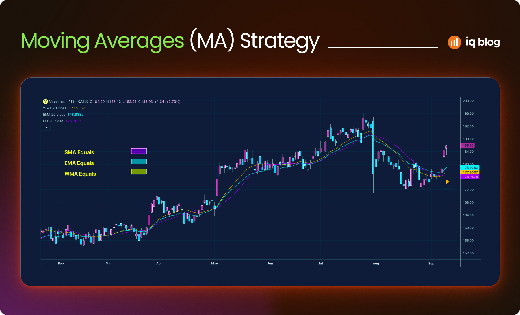
1. Moving Averages (MA)
Moving Averages are essential tools for traders who want to understand price direction without the noise of intraday fluctuations. They smooth out data over time, making trends easier to spot. Most traders begin by learning how to use them and many continue using them as core components of their strategies.
What Moving Average Does
A Moving Average shows the average price of an asset over a specific number of periods. On TradingView, you can easily customize the length, color and type of MA for any asset or timeframe.
- SMA (Simple Moving Average) – Adds up all the closing prices in the chosen period and divides by the number of periods.
- EMA (Exponential Moving Average) – Gives more weight to recent prices, making it more sensitive to short-term market movement.
Traders often apply multiple moving averages to spot the strength and direction of a trend.
How to Use It
- Trend Detection – A rising MA confirms upward momentum. A falling MA signals a downtrend. The 50 EMA and 200 SMA are two of the most widely used trend filters.
- Crossover Signals – When a short-term EMA (e.g. 9) crosses above a longer EMA (e.g. 21), it suggests bullish momentum. The opposite crossover suggests bearish momentum.
- Dynamic Support and Resistance – In trending markets, prices often bounce off key MAs. For instance, in a strong uptrend, price may pull back to the 20 EMA before continuing higher.
Strategy Example
Suppose a trader applies a 21 EMA and a 55 EMA to the chart. When the 21 EMA crosses above the 55 EMA on the 1-hour chart, the trader begins looking for long entries. If price pulls back toward the 21 EMA and holds, they consider entering the trade with a stop-loss just below the EMA.
Visualization Tip
On TradingView, use contrasting colors (like blue for the short EMA and red for the long EMA) to quickly spot crossovers and trend shifts. Combine with price action or volume for higher-probability signals.
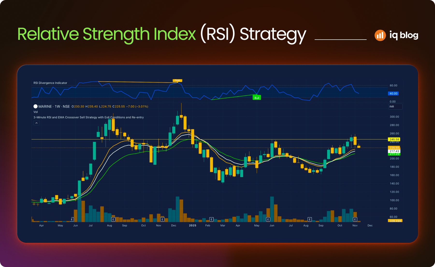
2. Relative Strength Index (RSI)
The Relative Strength Index (RSI) is a momentum oscillator that helps traders evaluate the speed and size of recent price changes. It moves between 0 and 100 and is often used to identify overbought or oversold conditions.
What It Does
RSI compares the average gain and loss over a specified period, usually 14 periods. A value above 70 suggests the asset might be overbought. A value below 30 indicates it may be oversold. However, RSI levels should not be viewed in isolation—price structure and trend direction matter.
On TradingView, RSI is displayed as a line graph beneath the price chart. Users can adjust the length and overbought/oversold levels.
How to Use It
- Overbought/Oversold Signals – In a ranging market, RSI values above 70 may signal a pullback is near. Below 30 may suggest a bounce is coming.
- Divergence Signals – If the price makes a new low, but RSI forms a higher low, it can suggest weakening bearish momentum. The opposite applies in a bullish scenario.
- Trend Confirmation – In strong trends, RSI may stay in the overbought or oversold zone for extended periods. In such cases, traders use RSI to confirm momentum rather than predict reversals.
Strategy Example
A trader uses RSI with a 14-period setting on a 1-hour chart. If RSI drops below 30, then climbs back above 30 while price forms a double bottom, the trader considers entering long. They combine this with a confirmation from the moving average trend.
Visualization Tip
Use RSI in combination with support and resistance zones to avoid false reversal signals. On TradingView, add horizontal lines at 30 and 70 for quick reference and watch for RSI divergence with price structure.
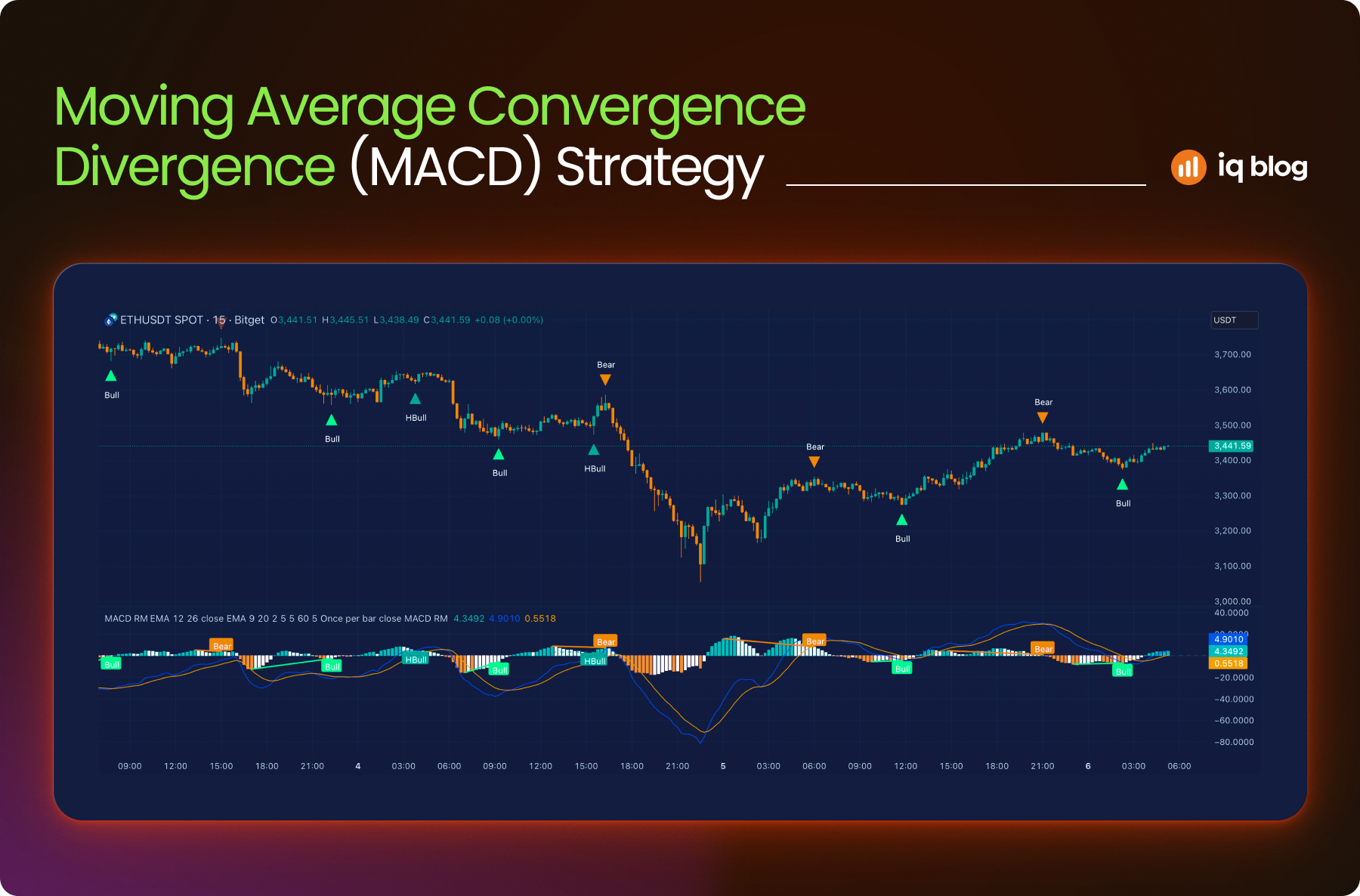
3. Moving Average Convergence Divergence (MACD)
MACD is a trend-following and momentum indicator that reveals changes in the strength, direction and duration of a trend. It’s based on the relationship between two moving averages and is especially helpful during trending markets.
What It Does
MACD consists of three components:
- MACD Line – The difference between a short-term EMA (usually 12) and a longer-term EMA (usually 26)
- Signal Line – A 9-period EMA of the MACD line
- Histogram – The difference between the MACD line and the signal line
The histogram visually shows the momentum, with rising bars indicating increasing strength and falling bars showing weakening momentum.
How to Use It
- Signal Line Crossovers – When the MACD line crosses above the signal line, it may suggest bullish momentum. A downward crossover often signals bearish momentum.
- Zero Line Crosses – MACD crossing above the zero line indicates upward trend potential; crossing below suggests downward trend continuation.
- Divergence – If the price is making higher highs but MACD is making lower highs, it may signal weakening momentum and a potential reversal.
Strategy Example
A trader watches for a bullish crossover on the MACD while price is pulling back to a rising 50 EMA. When both align, the trader considers entering a long position. Exit is planned when MACD flattens or crosses downward.
Visualization Tip
Use the MACD histogram on TradingView to spot momentum shifts quickly. Pair it with RSI to filter out weak signals or false trends.
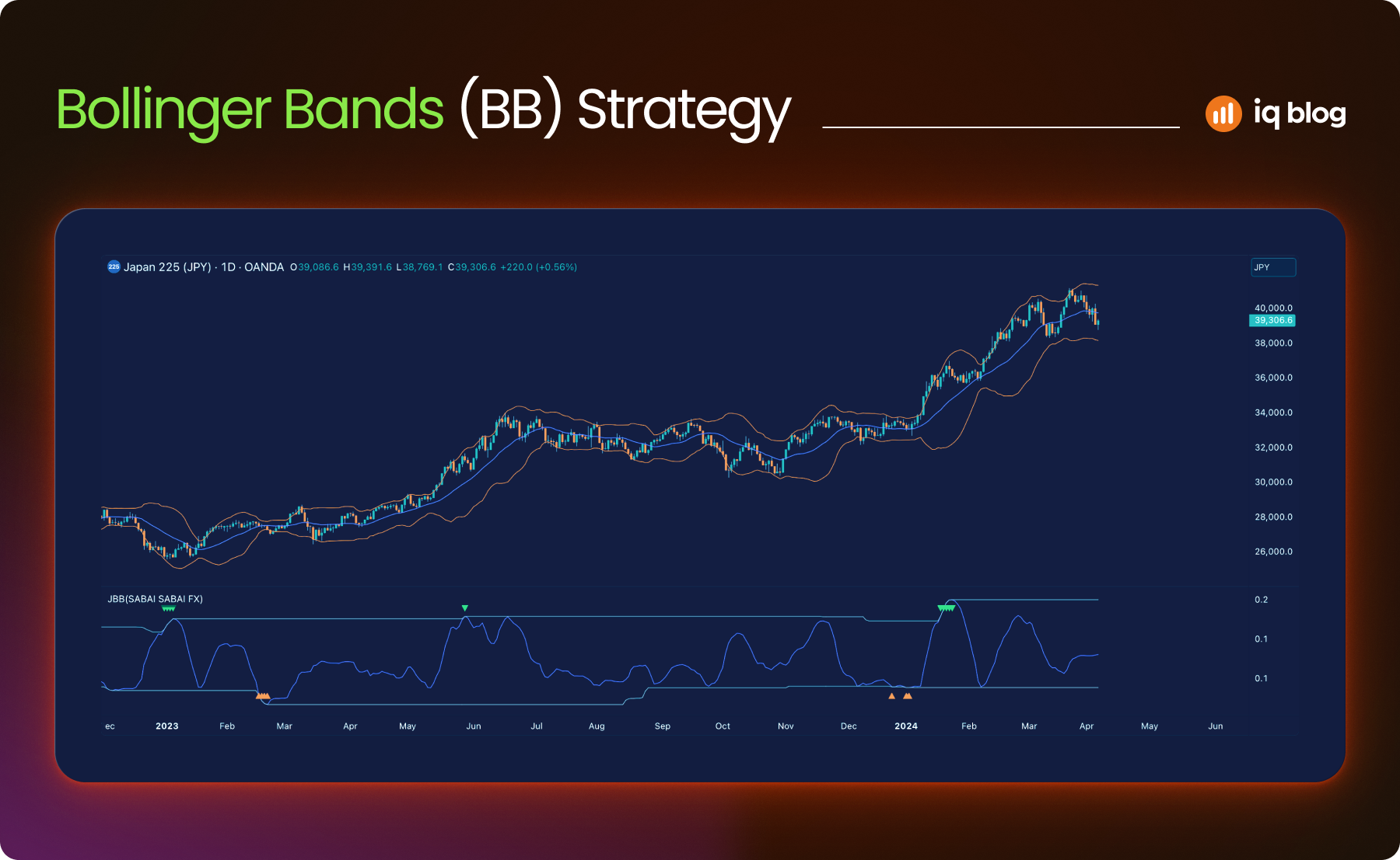
4. Bollinger Bands
Bollinger Bands are a volatility-based indicator that helps traders visualize price extremes and potential breakouts. They expand and contract with market volatility, offering dynamic zones for overbought and oversold conditions.
What It Does
Bollinger Bands consist of three lines:
- Middle Band – A simple moving average (usually 20-period)
- Upper Band – The middle band plus two standard deviations
- Lower Band – The middle band minus two standard deviations
When the market is calm, the bands contract. When volatility rises, the bands widen. This behavior makes them useful for spotting price squeezes and expansions.
How to Use It
- Breakout Signals – A squeeze (tight bands) followed by price breaking out can signal the start of a new trend.
- Mean Reversion – When price touches the upper or lower band, it may revert toward the middle band, especially in ranging markets.
- Volatility Detection – Band expansion confirms increased volatility. Sharp moves outside the bands may indicate exhaustion.
Strategy Example
A trader monitors for a Bollinger Band squeeze on the 15-minute chart. When price closes outside the band with a spike in volume, they consider entering in the direction of the breakout. A tight stop-loss is set near the middle band.
Visualization Tip
On TradingView, use Bollinger Bands together with RSI or MACD to confirm breakout direction. You can also color-code bands to highlight compression zones more clearly.
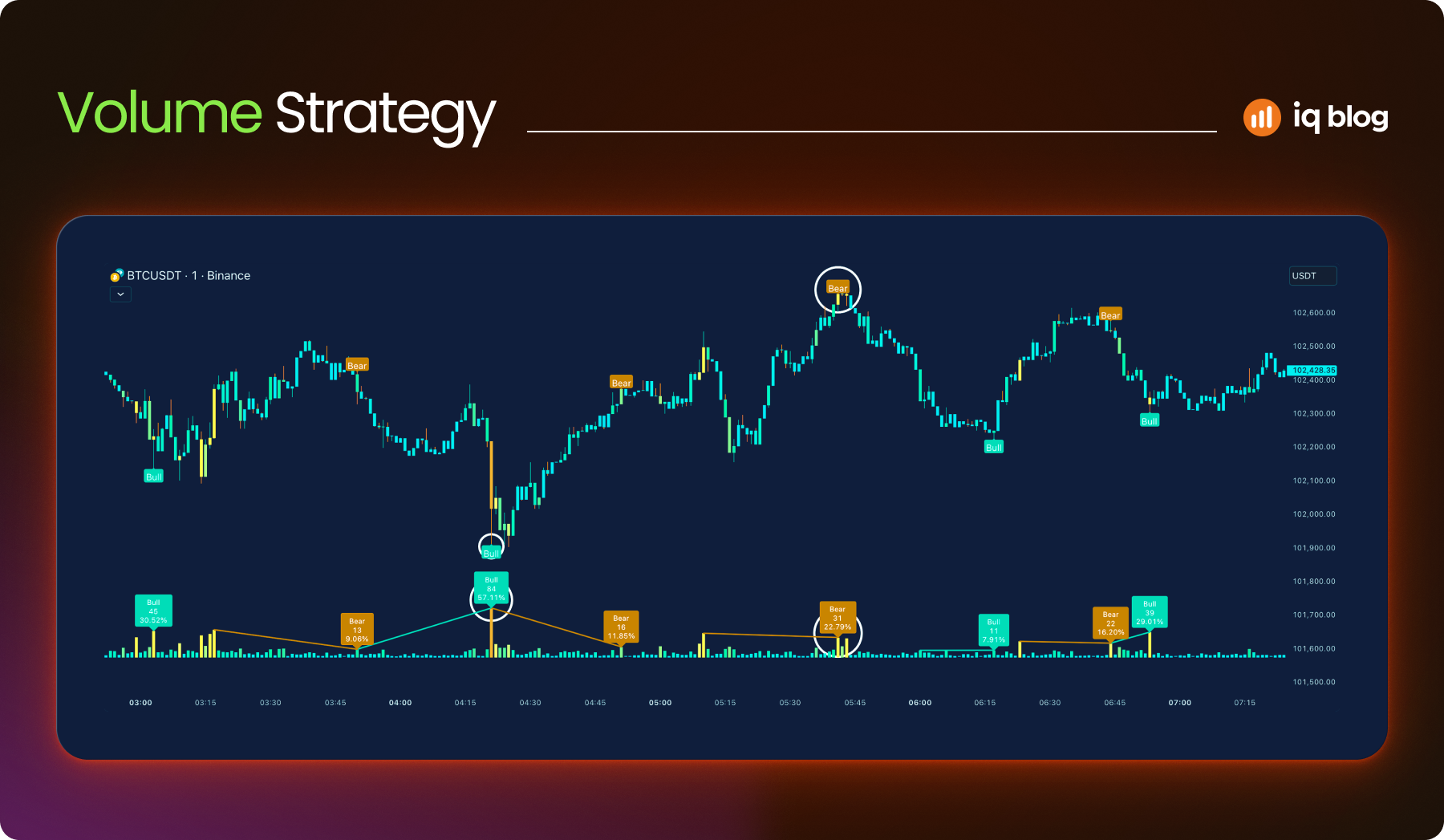
5. Volume
Volume is a core market indicator that reflects the total number of shares, contracts or units traded in a given period. It plays a vital role in validating price movements and identifying market strength or weakness. Most experienced traders consider volume analysis essential, especially for breakout and trend confirmation strategies.
What It Does
Volume reveals the intensity behind price movement. High volume suggests strong conviction behind a move, while low volume can indicate hesitation or lack of interest. TradingView displays volume as vertical bars at the bottom of the chart, with each bar representing the trading activity in that candle’s timeframe.
How to Use It
- Confirming Breakouts – A breakout from support or resistance on strong volume is more likely to continue. Weak volume may signal a fakeout.
- Spotting Reversals – Volume spikes near trend exhaustion can suggest a potential reversal. For example, after a strong rally, a sudden volume surge with a doji candle may signal selling pressure.
- Trend Strength – Rising price with rising volume confirms bullish strength. Falling price on increasing volume confirms bearish pressure.
Strategy Example
A trader monitors volume during a consolidation zone. Once the price breaks out of the range with a volume spike above the 20-period average, it enters the breakout direction. They exit if volume drops significantly during the follow-through.
Visualization Tip
Enable “Volume MA” on TradingView to see average volume levels. This helps filter out noise and spot meaningful spikes. Use colored volume bars to match bullish/bearish candles for easier reading.
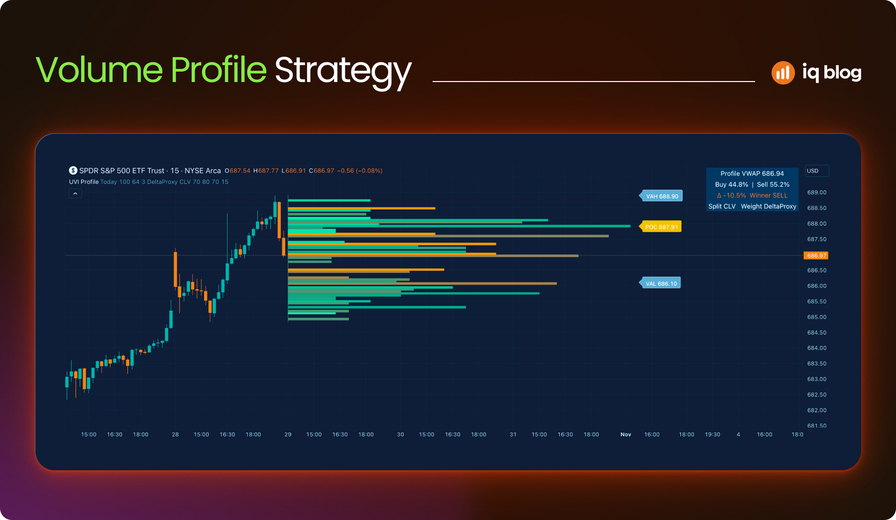
6. Volume Profile
Volume Profile is a powerful indicator that shows how much trading activity occurred at each price level over a chosen period. Unlike traditional volume bars that display activity per candle, Volume Profile maps volume horizontally on the price axis, revealing where the market is most and least interested.
What It Does
Volume Profile highlights price levels where traders were most active. These levels can act as strong support or resistance. The indicator shows:
- Point of Control (POC) – The price level with the highest traded volume
- High Volume Nodes (HVN) – Areas with dense trading activity
- Low Volume Nodes (LVN) – Price levels with little activity, often resulting in sharp moves
This helps traders see where the market has built value or where it may reject a price quickly.
How to Use It
- Support and Resistance – POC and HVN often act as strong support/resistance zones
- Breakout Zones – Price moving through LVN can move quickly, as there’s little prior interest
- Entry/Exit Planning – Traders use Volume Profile to fine-tune entries near HVN or to avoid LVN zones
Strategy Example
A trader identifies a POC on the 1-hour chart. Price pulls back to that level after a breakout. The trader enters long, assuming the level will act as support due to prior volume concentration.
Visualization Tip
Use TradingView’s “Fixed Range Volume Profile” to apply the indicator to a specific time window. This provides more control and precision when analyzing market structure.
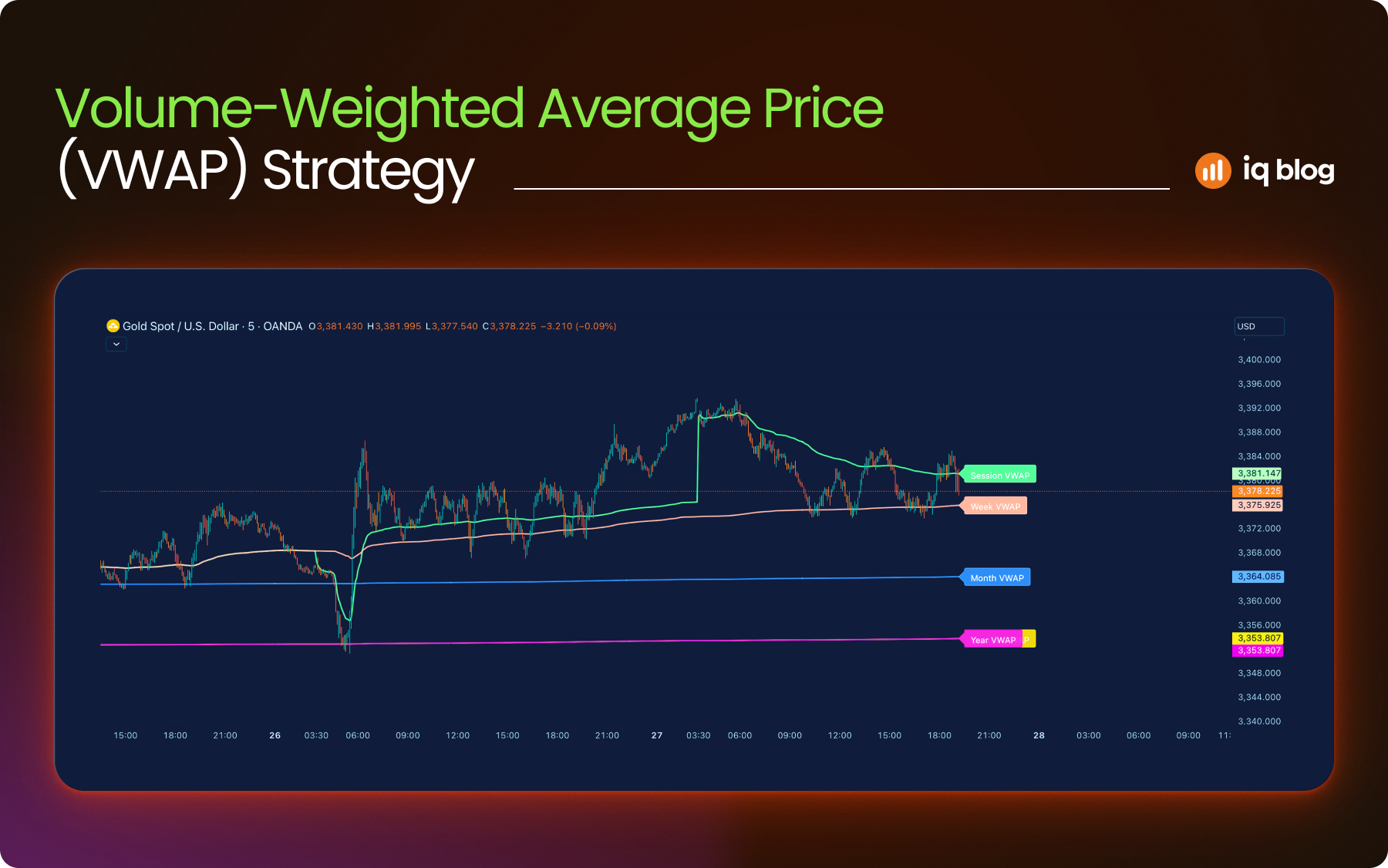
7. VWAP (Volume-Weighted Average Price)
VWAP is a price benchmark used by both institutional and retail traders to measure the average price of an asset, weighted by volume. It reflects the true average value of trades over a session and helps traders understand whether the current price is above or below fair value.
What It Does
VWAP combines price and volume data into a single line. It updates throughout the day, starting fresh with each new session. This makes it useful for intraday strategies. If price is above the VWAP line, buyers are in control. Below it, sellers dominate.
VWAP is widely used by institutions to assess trade execution quality and avoid market impact.
How to Use It
- Trend Bias – Price above VWAP = bullish bias. Price below VWAP = bearish bias
- Support and Resistance – VWAP often acts as a magnet. Price may revert to it during the session
- Mean Reversion – In ranging markets, traders use VWAP as a reversion target
Strategy Example
An intraday trader monitors VWAP on the 5-minute chart. When price breaks above VWAP with increasing volume and holds above it, they look for long setups. A stop-loss is placed just below the VWAP to limit risk.
Visualization Tip
On TradingView, VWAP can be applied as a standard or anchored indicator. Use color-coded bands to indicate deviation zones or pair VWAP with moving averages for confluence.
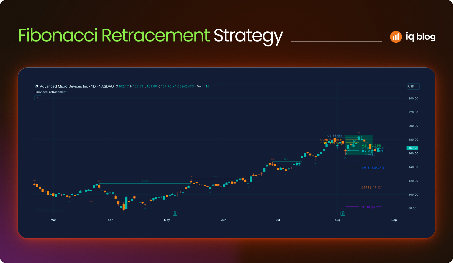
8. Fibonacci Retracement
Fibonacci Retracement is a tool based on key ratios derived from the Fibonacci sequence. Traders use it to identify potential reversal levels, especially after strong trends. It helps forecast where a pullback might end before the trend resumes.
What It Does
The tool plots horizontal lines across a chart based on percentage retracements: 23.6%, 38.2%, 50%, 61.8% and 78.6%. These levels act as potential support or resistance zones. The most commonly used are 38.2% and 61.8%.
Fibonacci is not predictive but reactive, it gives structure to a pullback or bounce within a trend.
How to Use It
- Trend Continuation – After a strong move, price often retraces to the 38.2% or 61.8% level before continuing
- Entry Points – Traders use these levels to enter on a pullback with tighter risk
- Confluence Zones – Fibonacci levels combined with support, moving averages or volume levels can create high-probability zones
Strategy Example
A trader identifies an uptrend on the 4-hour chart. They use the Fibonacci tool from the swing low to swing high. Price pulls back to the 61.8% retracement and forms a bullish pin bar. The trader enters long, targeting a retest of the high.
Visualization Tip
In TradingView, customize your Fibonacci levels and color code each level. Combine them with trendlines or horizontal support zones for clearer decision-making.
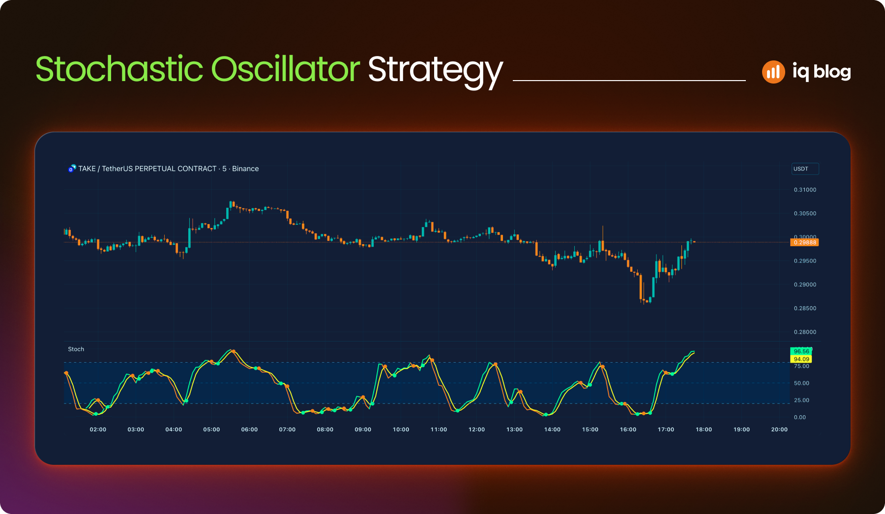
9. Stochastic Oscillator
The Stochastic Oscillator is a momentum indicator that compares an asset’s closing price to its price range over a set number of periods. It helps traders identify potential reversal points by signaling when an asset is overbought or oversold.
What It Does
The oscillator consists of two lines:
- %K Line – The main stochastic line, usually set to 14 periods
- %D Line – A moving average of %K, usually set to 3 periods
Values range between 0 and 100. Readings above 80 suggest overbought conditions. Readings below 20 suggest oversold conditions. However, these signals work best in non-trending markets.
How to Use It
- Overbought/Oversold Reversals – A drop from above 80 or rise from below 20 may hint at an upcoming reversal
- Signal Line Crossovers – A %K line crossing below the %D line in overbought territory can signal a sell. A crossover below 20 can suggest a buy
- Divergences – When price makes a new high or low but the oscillator does not, this can indicate weakening momentum
Strategy Example
A trader applies the Stochastic Oscillator to a 1-hour chart. When the indicator crosses below 80 and price hits a resistance zone, they look to short. The trade is confirmed if price closes below a recent low.
Visualization Tip
Use the “Stochastic RSI” in TradingView for a more sensitive momentum read. Combine the oscillator with horizontal zones to improve signal quality.
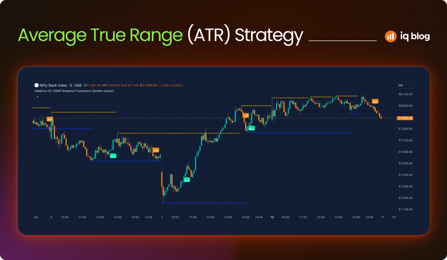
10. Average True Range (ATR)
ATR is a volatility indicator that shows how much an asset typically moves over a given period. It doesn’t indicate direction, but it helps traders understand the strength of price fluctuations. This makes it valuable for setting stop-loss levels or comparing volatility across assets.
What It Does
ATR calculates the average of the true range over a set number of periods (commonly 14). The true range considers the current high-low range, the previous close to the current high and the previous close to the current low, whichever is greatest.
A higher ATR means more volatility. A lower ATR indicates a calmer market.
How to Use It
- Stop-Loss Planning – Set stops based on a multiple of ATR to avoid being stopped out by normal price noise
- Trade Sizing – Reduce position size when ATR is high to manage risk and increase slightly during low volatility
- Breakout Confirmation – ATR spikes can confirm strength behind a breakout or breakdown
Strategy Example
A trader notices a low ATR period on the 15-minute chart. As price consolidates, they prepare for a breakout. When price breaks a key level and ATR starts rising, they enter with a stop 1.5x the ATR below the entry to allow room for volatility.
Visualization Tip
In TradingView, add ATR below your chart with a 14-period setting. Use it with price action or trend indicators to balance risk and entry points more precisely.
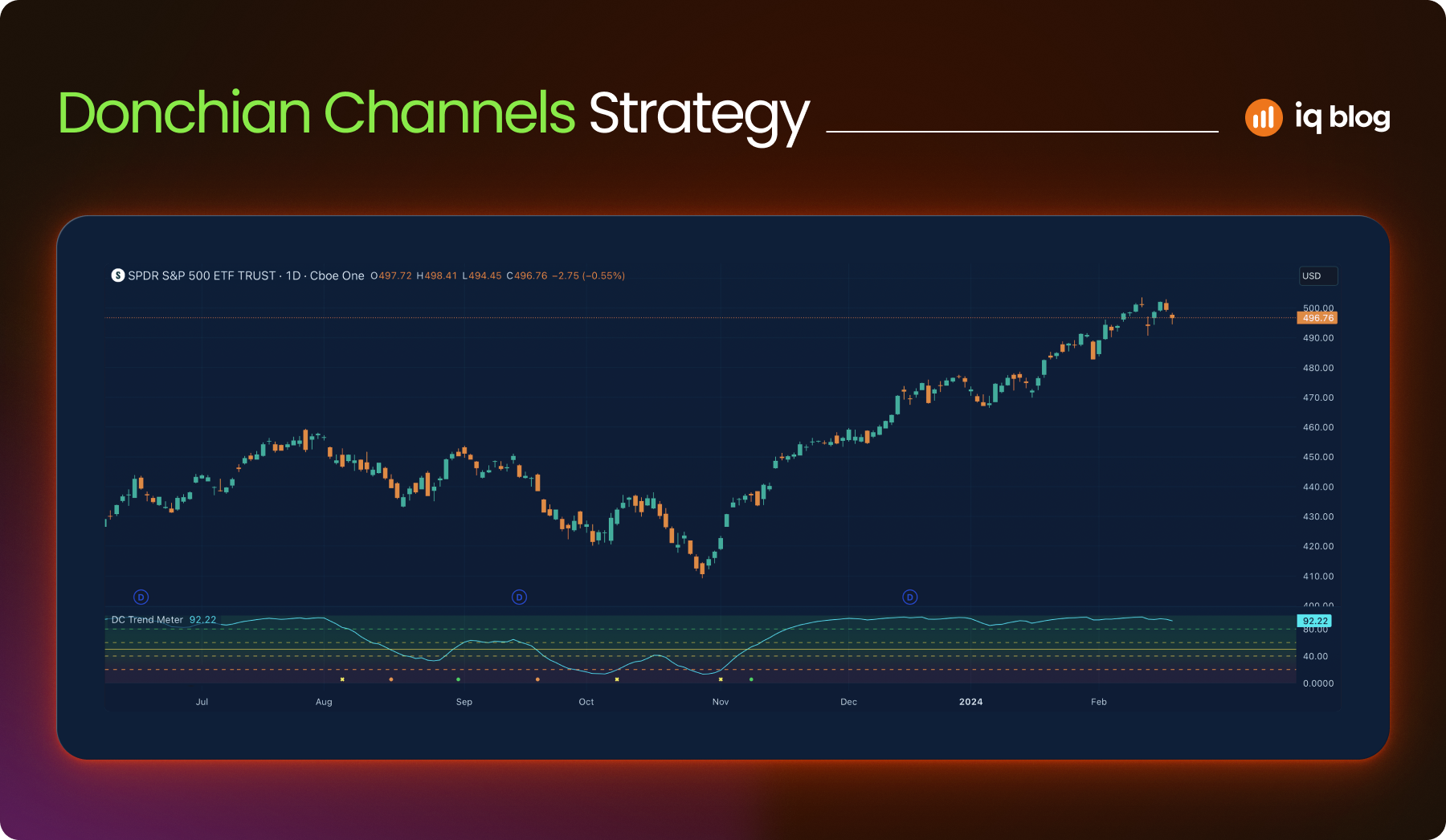
11. Donchian Channels
Donchian Channels show the highest high and lowest low over a chosen period. This highlights price range extremes and breakout levels.
What It Does
- Upper band – highest price in last X periods
- Lower band – lowest price in last X periods
- Middle line – average of the two
Donchian Channels are excellent for breakout and trend-following strategies.
How to Use It
- Break above the upper band can signal a bullish breakout
- Break below the lower band signals bearish momentum
- Middle line helps with re-entry or trailing stop guidance
Strategy Example
On a 1-hour chart, price breaks the upper band after days of consolidation. Volume confirms. The trader enters and uses the lower band as a dynamic stop.
Visualization Tip
Search “Donchian Channels” in TradingView’s indicator library. Adjust the length to 20 or 50 depending on the timeframe. Overlay directly on the chart to spot channel boundaries and breakout candles more clearly.
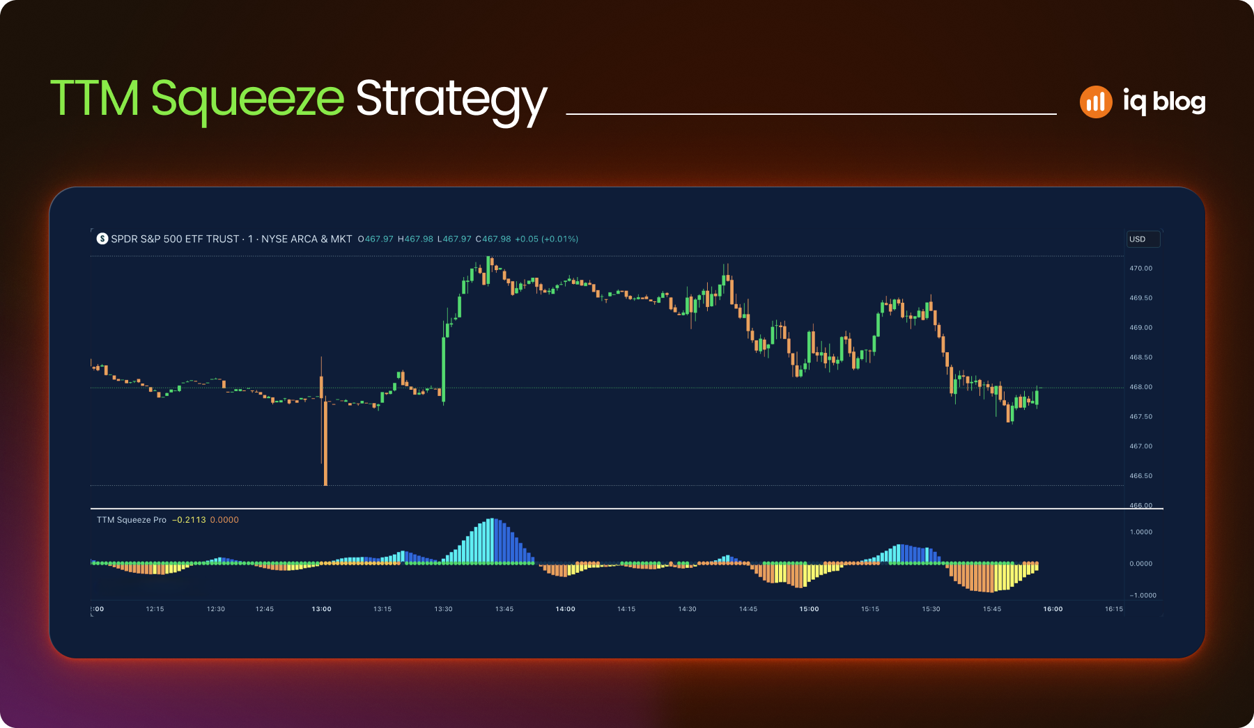
12. TTM Squeeze
TTM Squeeze combines Bollinger Bands and Keltner Channels to find periods of low volatility that could lead to explosive moves.
What It Does
When Bollinger Bands contract inside the Keltner Channels, the market is in a squeeze. A breakout from this range may follow. Dots and histogram bars signal the state of the squeeze and momentum.
How to Use It
- Red dots indicate a squeeze is on
- Green dot signals breakout direction
- Histogram shows bullish or bearish momentum building
Strategy Example
During a red dot squeeze, histogram bars flip from red to green. The trader prepares for a long breakout as volatility expands.
Visualization Tip
Search “TTM Squeeze” or “Squeeze Momentum” on TradingView’s public library. Use histogram color for momentum confirmation. Pair with Bollinger Band overlays for reference.
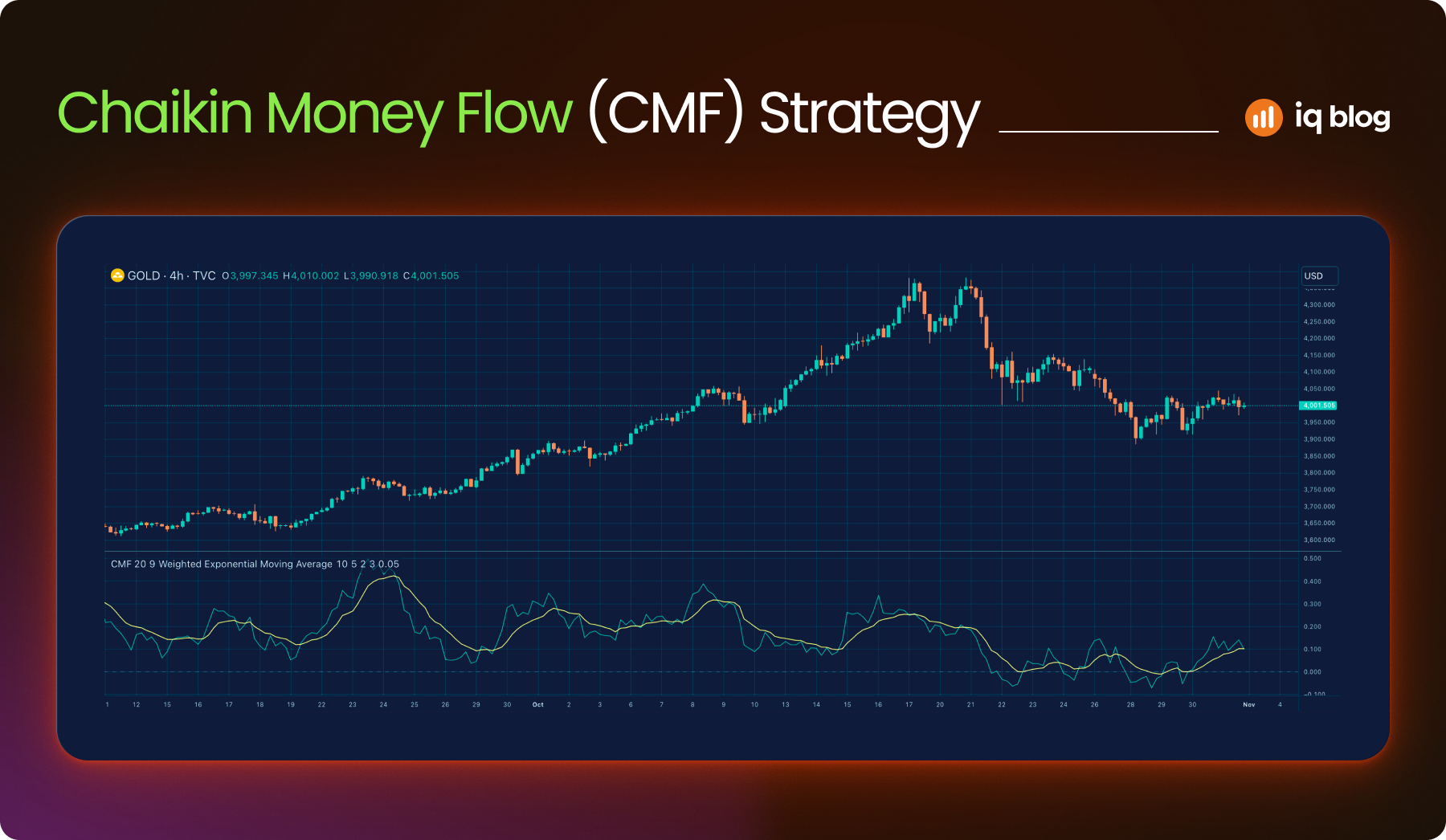
13. Chaikin Money Flow (CMF)
CMF gauges buying and selling pressure based on volume and price. It helps confirm trends and detect hidden accumulation or distribution.
What It Does
Chaikin Money Flow (CMF) oscillates between +1 and -1. Positive values signal buying pressure. Negative values suggest selling pressure.
How to Use It
- Use CMF to confirm breakouts
- Combine with trendlines to spot divergence
- Monitor prolonged positive/negative zones to gauge strength
Strategy Example
A bullish breakout occurs, but CMF remains below zero. This warns the trader that the move may lack volume support.
Visualization Tip
Add “Chaikin Money Flow” from TradingView’s built-in indicators. Use a midline (0.0) as a reference. Combine with RSI or trendlines for a full setup.
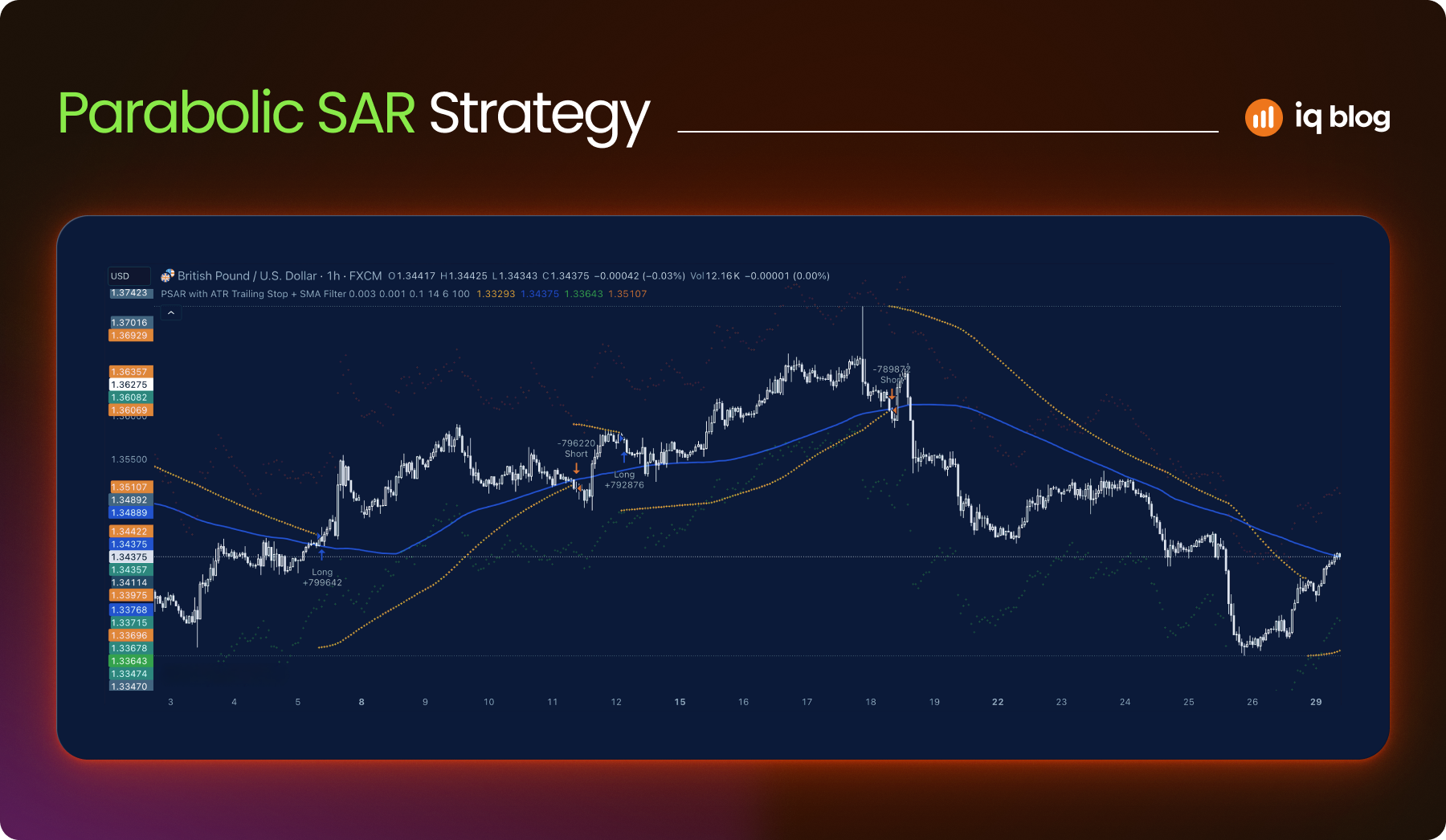
14. Parabolic SAR
The Parabolic SAR (Stop and Reverse) is a trend-following indicator that highlights potential reversal points and trailing stop levels. It’s most effective in trending markets and helps traders spot when to enter or exit a position.
What It Does
Parabolic SAR appears as a series of dots above or below price candles:
- Dots below price – Uptrend
- Dots above price – Downtrend
When the dots switch sides, it signals a potential trend reversal or exit point.
How to Use It
- Entry Timing – Enter long when dots flip below price, short when dots flip above
- Trailing Stops – Move stop-loss orders along with the SAR dots to protect profits
- Trend Confirmation – Combine with other indicators like moving averages for better confirmation
Strategy Example
A trader sees dots flipping below price on a 15-minute chart. The price is also above a rising 20 EMA. The trader enters long and adjusts the stop-loss along with each new SAR dot until the dots flip above price again.
Visualization Tip
On TradingView, add Parabolic SAR with default step and max values. Use it on trending assets, avoid it during sideways conditions, where false signals are more common.
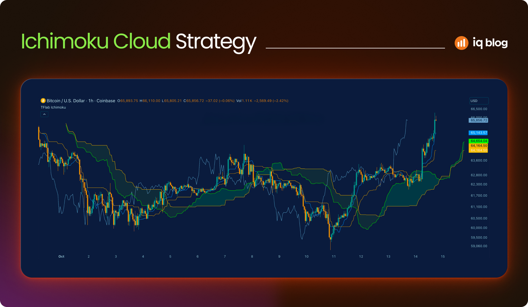
15. Ichimoku Cloud
Ichimoku Cloud is a comprehensive indicator that shows trend direction, momentum, support and resistance in one visual overlay. It may look complex at first, but it’s highly valuable for traders who want a complete view of market structure.
What It Does
Ichimoku includes five components:
- Tenkan-sen (Conversion Line) – Short-term trend
- Kijun-sen (Base Line) – Medium-term trend
- Senkou Span A & B – These form the cloud (Kumo)
- Chikou Span (Lagging Line) – Confirms current trend strength
The cloud changes color based on trend direction. Price above the cloud suggests bullish conditions. Price below the cloud is bearish.
How to Use It
- Trend Bias – Trade long when price is above the cloud and short when below
- Support/Resistance – The cloud often acts as dynamic support or resistance
- Breakout Signals – When price breaks through the cloud with confirmation from other lines
Strategy Example
On a daily chart, price breaks above the cloud while the Tenkan-sen crosses above the Kijun-sen. The Chikou Span is also above price. This triple confirmation gives a strong long signal.
Visualization Tip
Use Ichimoku Cloud on higher timeframes to identify long-term trends. Disable some elements (like the lagging line) on TradingView for a cleaner setup if needed.
Conclusion
Choosing the right indicators can transform how traders understand price action, trends and market structure. TradingView gives access to hundreds of tools, but mastering just a few powerful ones can significantly improve decision-making. Whether you’re tracking momentum, volatility or reversals, each indicator has its unique role. The key is learning how to use them in context, combining signals rather than relying on just one.
Start by testing these indicators on charts you follow. Identify which fit your strategy best. With consistent practice and analysis, they can become reliable parts of your trading process.
Frequently Asked Questions
What is the best indicator for beginners on TradingView?
Moving Averages are ideal for beginners. They are simple to understand and provide a clear view of trend direction.
Can I combine multiple indicators in one strategy?
Yes. Many traders combine RSI, MACD and moving averages to filter signals and reduce false entries.
How do I avoid overloading my charts with indicators?
Use no more than two or three complementary indicators. Focus on one function per tool, such as trend direction or volatility.
Are TradingView indicators suitable for all markets?
Yes. These indicators work across forex, stocks, crypto and commodities. But fine-tuning settings for each market is recommended.
Can I create custom indicators in TradingView?
Yes. TradingView supports custom indicators using Pine Script. Users can also import scripts from the public library.