Whether you are working with forex, stocks or commodities — results may vary depending on the tools you use. Picking a suitable price chart type is one of the most important parts of your trading set-up. So, how will you choose the best chart for trading that may complement your trading style and goals? Learning about the pros and cons of the most common types of charts may be a good place to start.
What are the main types of charts?
There are 4 trading chart types available on the IQ Option platform. They all have a few things in common.
- The vertical axis: it usually shows changes in the price of an asset.
- The horizontal axis: it displays the timeline for a chosen asset.
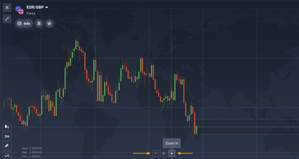
- Change of scale: you may zoom in to adjust the timescale and focus on small price changes. Or zoom out to see the larger swings and assess the asset’s performance over a longer timeframe.
All types of charts in trading have their advantages and disadvantages. So it might be useful to consider them before picking the most suitable option for your trading routine. Let’s go over each trading chart type separately to compare their characteristics.
Linear chart
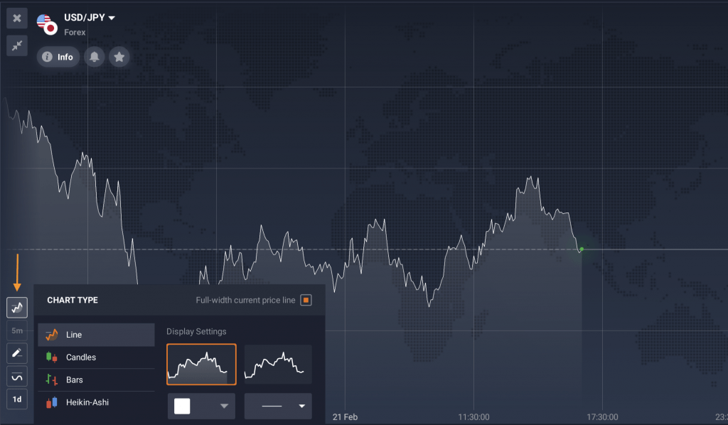
A linear chart is the most basic way to display data on the screen. This chart is generally considered to be easy to understand and apply. However, its indications may be lagging compared to other types of charts in trading. Especially when it comes to long-term trading approaches and application of advanced technical analysis tools.
Advantages of linear charts
🟩 The visual simplicity of the linear chart might be useful for short-term trading methods.
🟩 The linear chart may be easier to read. That is because it doesn’t include additional information such as the opening and closing prices, recent highs and lows prices, etc.
Disadvantages of linear charts
🟥 The linear chart is generally thought to be less suitable for in-depth analysis, especially on longer timeframes.
🟥 This trading chart type normally doesn’t allow traders to identify price dynamics on a larger scale.
You may also adjust the IQ Option chart settings to your liking. You can choose the chart colour, make the lines wide or narrow to make analysis more convenient for you.
Candlestick chart
Candles are widely considered to be the most popular trading chart type. Many experienced traders tend to apply them regularly, as they may provide additional opportunities for technical analysis.
This type of chart for trading is more advanced than the previous one. With a line chart, everything is straight-forward: the price goes up and down, and the trend line follows it.
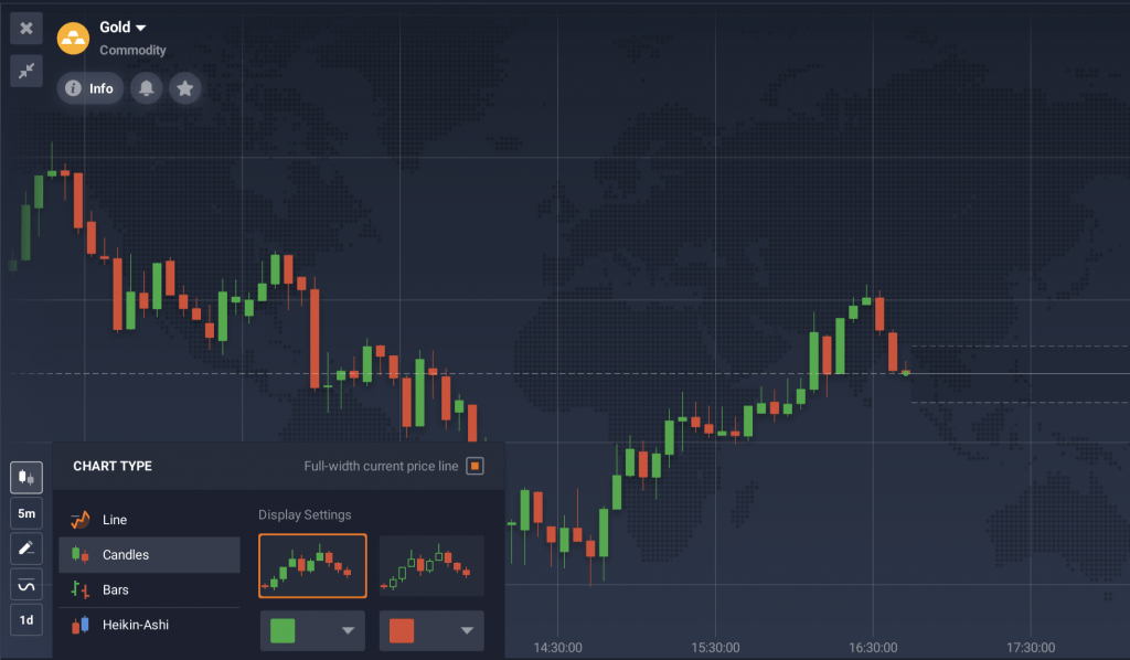
Candles work differently. Each candle displays not just a moment but a certain period of time. Therefore, it provides further information about the asset price fluctuations during that period. It includes:
- The opening price (the price at the beginning of that period);
- The closing price (the price at the end of it),
- The high and low points the price reached during the period.
The distance between opening and closing prices is called the body of the candle. The thin outliers above and below the candle are called the shadows.
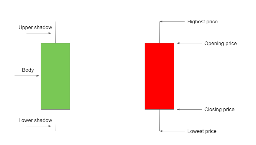
The candle will change its colour based on the performance of the asset. When the closing price exceeds its opening price, the candle will turn green. If the closing price was below the opening price, the candle will be red. To learn more about candles in CFD trading, please refer to this article: Trading with Candlestick Patterns.
Now let’s review the pros and cons of using this chart type in trading.
Advantages of candle charts
🟩 This chart type might be more suitable to analysing the asset performance on different timeframes.
🟩 The candlestick chart may provide more extensive information about price changes (opening, closing, high and low prices).
🟩 Candlestick charts might also work well in combination with various technical indicators, potentially providing more precise information.
Disadvantages of candle charts
🟥 Some novice traders may feel overwhelmed by the amount of information offered by this type of chart for trading.
Remember that any trading decisions should be based on thorough analysis. You may choose different technical analysis tools to find indications on price charts, like the MACD indicator or the Donchian Channels.
Bars
Bars are an alternative take on the candlestick chart. While they might look a little different, they rely on the same principles and work similarly.
This trading chart type also displays opening and closing prices, as well as recent highs and lows. Just like candles, bars will turn red if the price decreases over the period of one bar. Or green in case the price increases over the same period.
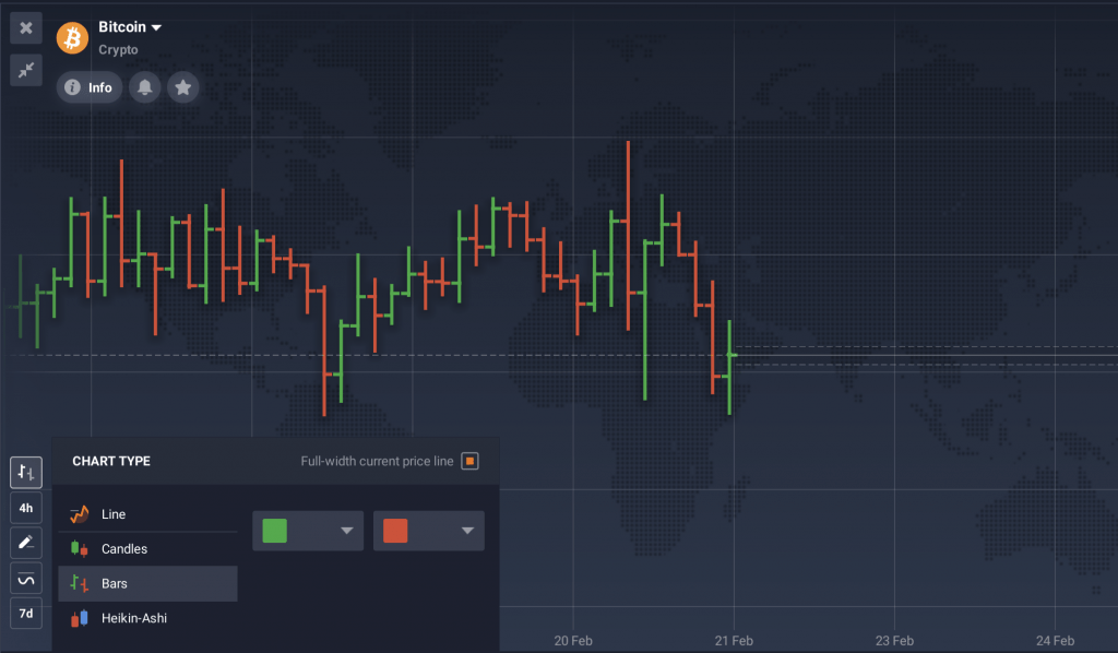
Here are some of the main factors to keep in mind when considering bars as a potential chart for CFD trading.
Advantages of bar charts
🟩 This trading chart type may demonstrate all the necessary information similarly to candles but from a slightly different perspective.
🟩 It might be useful for identifying patterns.
Disadvantages of bar charts
🟥 Bar chart for trading might be harder to read than a standard line chart or candlesticks.
Heikin-Ashi
An alternative to the classic IQ Option charts, Heikin-Ashi may suit those looking for a smoother version of candlesticks. This might assist in understanding the trend and spotting potential reversals.
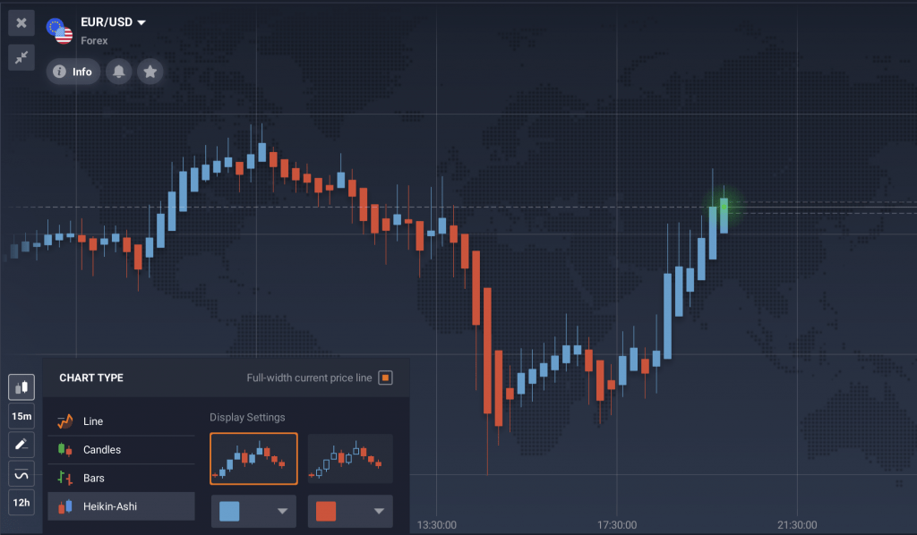
Advantages of Heikin-Ashi charts
🟩 The Heikin-Ashi chart smooths out the price movements, making it easier to identify overall trends.
🟩 This chart for trading might show less drastic price movements than other chart types, potentially avoiding false indications.
Disadvantages of Heikin-Ashi charts
🟥 This type of chart for trading may not be ideal for working on short-term timeframes. Heikin-Ashi might be slower to react to changes in trend or momentum, making it harder to notice minor price movements.
🟥 Heikin-Ashi charts smooth out the price movements, which might be a downside for traders who want to see the details of each candlestick.
Heikin-Ashi or candlestick chart: which is better?
Each type of chart in trading has its own characteristics that might be useful depending on your approach and goals. Still, sometimes it may be challenging to figure out which option may be considered the best chart for trading in a particular case.
Gathering more information about each chart might be helpful to make an informed decision. So let’s have a look at the key differences between the most popular charts for trading – Heikin-Ashi and candlesticks.
Value calculation
Heikin-Ashi charts normally calculate values by averaging the opening, high, low, and closing prices of the previous period. Candlestick charts, on the other hand, rely on the open, high, low, and close prices of each period.
Visual presentation
Heikin-Ashi chart for trading might exhibit a more stable appearance by smoothing out price fluctuations. They also present a distinct range of prices compared to the candles on traditional candlestick charts.
Trend evaluation
Heikin-Ashi charts might be better at identifying overall trends than candlestick charts by filtering out market noise. However, it may also offer less information about smaller price fluctuations.
Complexity
Some traders may consider candlestick charts easier to read and understand. The Heikin-Ashi charts might be more intricate. The smoothed candles might potentially complicate the identification of certain patterns that are easier to spot on the candlestick charts for trading.
So which of these options may be considered the best chart for trading? There is no one-size-fits-all solution. It’s up to individual traders to learn about the pros and cons of each type of chart for trading to make the optimal decision. You may test different IQ Option charts on the platform to find the one that will complement your trading approach and help you achieve your goals.

