Heiken Ashi is an
alternative take on the candlestick chart. Some say that it can help traders spot opportunities earlier than the regular candlestick chart. What it does is smooth out the price action, making it easier to interpret and less jagged. In other words, it combines the advantages of a regular candlestick chart and a moving average.
The way two candlestick charts look is almost identical (except for the colors), yet the ways the candles are calculated are radically different. While the regular candlestick uses open-high-low-close prices, Heiken Ashi uses average prices. They are calculated according to the following logic:
- Close = (open+high+low+close)/4, equal to the average price of the current candle.
- Open = (open of previous candle + close of previous candle)/2, equal to the midpoint of the previous candle.
- High = open, close or high of the current candle, whichever is greater.
- Low = open, close or low of the current candle, whichever is smaller.
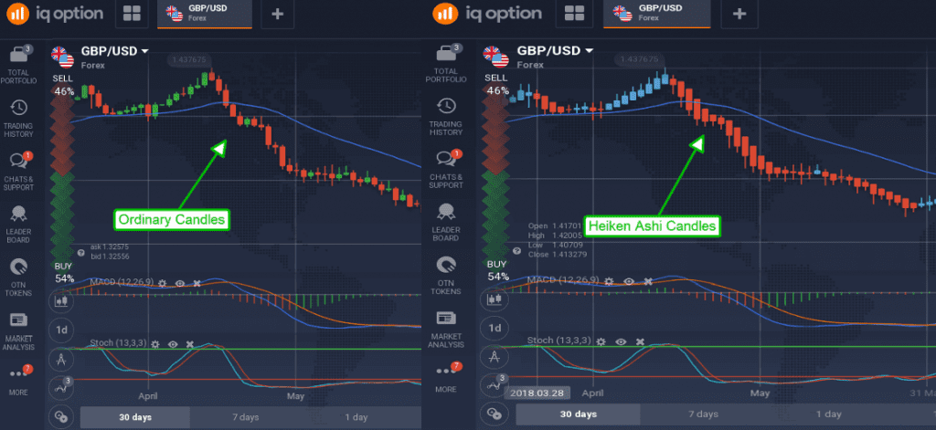
Here’s how the same price chart will look like when using regular candles and Heiken Ashi. Not only is there a slight difference in colors (growing candles are colored green on the left and blue on the right), the price chart with Heiken Ashi looks smoother.

There are several benefits to the Heiken Ashi chart. First, it is buttery smooth. The Heiken Ashi chart was created with the idea of a
smooth price flow, that is easier to follow and more aesthetically pleasing than the regular one. There are no gaps or jagged moves on this price chart. Secondly, the two chart types are
colored in a different way. Regular candles may turn green or red depending on the direction of the price movement. Heiken Ashi candles are colored red during a downtrend and blue during an uptrend. This is done on purpose so that traders do not confuse the two. Thirdly, there are
differences in the way candles are calculated. Since Heiken Ashi uses average prices there may be some discrepancies between the assets “current” price and the price indicated on the candle.
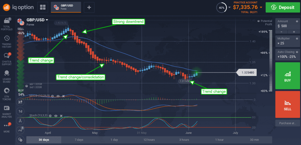
There are five primary signals that a trader can receive from Heiken Ashi. First is one or several blue candles with no lower shadow. It may be a sign of a strong buying pressure. Second is a series of blue candles, which does correspond to a regular uptrend. Third is a series of small red and blue candles with visible upper and lower shadows, which means that the trend may change its direction soon enough.

Fourth is a series of red candles, which means that sellers have the upper hand. Fifth is one or several red candles with no upper shadow, which is obviously a sign of a downtrend.
Now, when you know how to use Heiken Ashi in trading, you can proceed to the trading platform and give it a try. It may be wise to try it on the demo account first in order to understand this candlestick chart better.
 There are several benefits to the Heiken Ashi chart. First, it is buttery smooth. The Heiken Ashi chart was created with the idea of a smooth price flow, that is easier to follow and more aesthetically pleasing than the regular one. There are no gaps or jagged moves on this price chart. Secondly, the two chart types are colored in a different way. Regular candles may turn green or red depending on the direction of the price movement. Heiken Ashi candles are colored red during a downtrend and blue during an uptrend. This is done on purpose so that traders do not confuse the two. Thirdly, there are differences in the way candles are calculated. Since Heiken Ashi uses average prices there may be some discrepancies between the assets “current” price and the price indicated on the candle.
There are five primary signals that a trader can receive from Heiken Ashi. First is one or several blue candles with no lower shadow. It may be a sign of a strong buying pressure. Second is a series of blue candles, which does correspond to a regular uptrend. Third is a series of small red and blue candles with visible upper and lower shadows, which means that the trend may change its direction soon enough.
 Fourth is a series of red candles, which means that sellers have the upper hand. Fifth is one or several red candles with no upper shadow, which is obviously a sign of a downtrend.
Now, when you know how to use Heiken Ashi in trading, you can proceed to the trading platform and give it a try. It may be wise to try it on the demo account first in order to understand this candlestick chart better.

